Viewing entries tagged
process

One Year With A Cintiq

One Year With A Cintiq

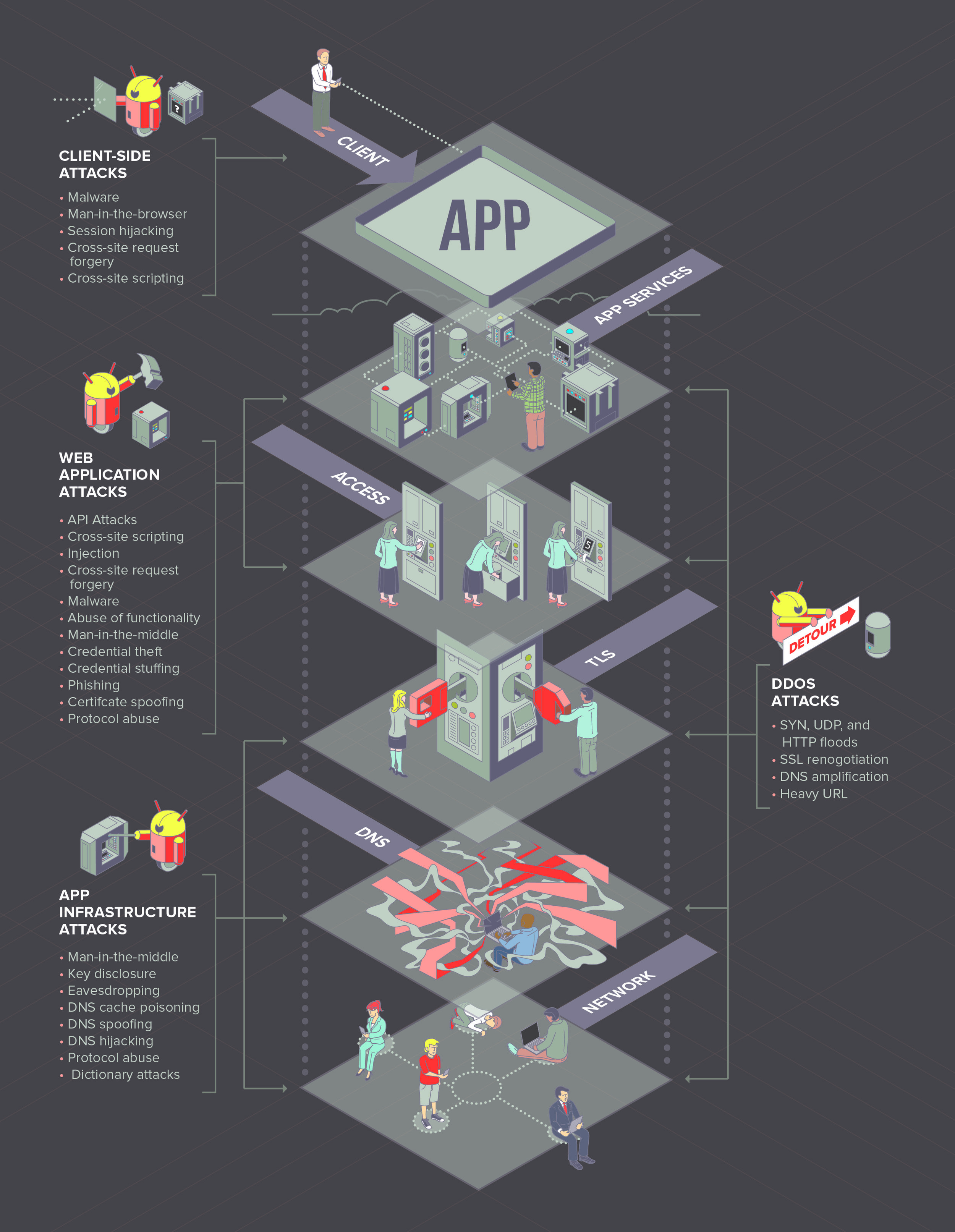
My 24” Wacom Cintiq Pro with Touch Control completely replaced my iPad for my client work within a matter of months and I also use it everyday as a second monitor. I only use my iPad when I travel or need a mobile studio (combined with Sidecar).

I do think that the iPad is still a better pure drawing tool, due in large part to its flawless pinch and zoom capabilities. I’d recommend not purchasing the Cintiq with touch control—it’s so sensitive that I have it turned off 99% of the time and just use the EK remote control for rotation and zooming.

As far as processes go, the Cintiq can’t be beat. Its ability to use native programs—Photoshop, Sketchbook, ClipStudio, illustrator, etc. is a huge time saver rather than iPad’s multi-step process simply to export a file to my desktop machine.

More than anything, I appreciate the larger canvas—It allows a natural shoulder movement for drawing and painting.

In terms of ergonomics, I have to emphasize that my comfort level with the iPad is very low and the Cintiq was never going to worsen the issues for me.

My set up for the Cintiq includes a Fully brand hydraulic standing desk, the Wacom flex arm, and a soft floor pad—all of which allow me to sit or stand comfortably at any height. While it doesn’t completely solve my neck and back issues, it’s significantly more comfortable for me than being hunched over scratching on an iPad.

I find the Cintiq to be indispensable for my workflow. That being said, I’m a full-time illustrator and it made sense for my needs.

If you want more screen real estate, I highly recommend it. You’ll adjust to your new workflow very quickly and you probably won’t ever utter a long string of curses like you would after reaching your layer limit in Procreate or trying to export a file (looking at you iPad).

If you simply want more “space” to rest your hand/arm, then I’d recommend purchasing the Sketchboard Pro for iPad and calling it a day.

Three Years Illustrating With The iPad Pro

Three Years Illustrating With The iPad Pro

For the past three years, I’ve used the first and second generation iPad Pro exclusively to create the vast majority of my client and personal illustration work. As a result, I have a handful of opinions about working with this device.

How-To: Teen Attacker Triptych

How-To: Teen Attacker Triptych

I think it’s safe to say that you will have some semblance of a layout rattling around in your head prior to picking up a pencil. Even if that vision is hazy, hashing out the main characters first will aid you in nailing down the layout. Sometimes the brain-to-paper translation isn’t as clear as you’d like.

How-To: Jasmine

How-To: Jasmine

Process and patience are the two most important components in realistic drawing—not your tools. When you find the perfect balance, your best friend’s personality will begin oozing off the page long before you’ve finished the drawing … as well as every ounce of heart you put into it.

How to: Gamerbot

How to: Gamerbot

Going digital is all about process and once you nail down what works best for you, it’s off the to the races. But first, you will need to figure out which app you want to use … I work primarily with Procreate.

How-To: Lawrenceburg Poster

With big jobs that have a lot of moving parts, process and organization are everything. I walk you through the creation of the Lawrenceburg poster from concept to color.

F5Labs Protecting Applications Report: Version 2

The Project

I was tasked with "updating" the following graphic. This graphic is the foundational concept behind my client's entire business. In other words, it's been used to sell their services for years. 

Application Security Tiers

At first glance, there seems to be a lot of information being presented. What you don't see is any real clue describing what's happening. Without the assistance of paragraphs of text or a salesperson, the viewer is left to their own devices to derive any meaning.

The application "stack" is represented by icons that tell the viewer very little. And the accompanying text identifiers are equally amorphous.

You'll also note a variety of graphic elements that are meant to clue the viewer in to a larger idea, but all of these elements largely fail to create a cohesive visual narrative for anyone trying to decipher the graphic.  


My Solution

The solution I arrived at solves these issues — I created visual metaphors that accurately depict what literally happens at each tier. The simplicity of the imagery and design affords a viewer with no prior knowledge of the basic concepts a means of "creating" a narrative for themselves without the help of accompanying text. 

The "isometric" grid underlying this illustration helps create a plane for the tiers. I added flags at each level to help draw the users eye through the entire illustration. Once the basic art was created, I made a few slight adjustments to accommodate the text for the next two graphics. 

Application Security Tiers Revisited

Application Security Tiers Revisited

After

Before

In layout

Overall, this is a highly successful piece. That it was a casualty of "committee" is just a consequence of opinion. It happens. 

Stay tuned for the next version. 

How-To: Craft CMS 3 Installer

The iPad is a marvelous drawing tool. But it does lack in some key areas that will force you to decide whether or not they are deal breakers. In this tutorial, I’ll share some tips and tricks and try to convince you why you shouldn’t care about what the iPad isn’t and focus instead on what it is.

Loryka

Loryka

Loryka was a groundbreaking web security company and tool developed by entrepreneur and programmer Justin Shattuck. In his own words, Loryka is "a platform and data pipeline that allows researchers to gain insights into the attacks we see [on the web]."

Craft CMS 3 Installer

Craft CMS 3 Installer

At the 2017 PEERS Conference, I floated the idea of updating the installer illustration for Craft CMS 3 to the head honcho and resident genius at Pixel & Tonic, Mr. Brandon Kelly. In addition to the fact that his karaoke skills will instantly remind you of an angrier, out-of-tune Henry Rollins from Black Flag, he's also a fan of good-ish drawering skills. I'd illustrated the installer screen for Craft CMS 1 years ago and it seemed to me that the impending release of the biggest update to his flagship product might be the perfect opportunity to update the installer artwork. A few months later, Brandon gave me a call. 

What is Craft?

Craft is a ground-breaking content management system used by web developers around the world to build highly complex custom websites that are easy for their clients to manage.

This artwork was created for the installer tool that installs an instance of Craft on a web server.

Final Illustration

Concept

He and his team wanted to explore the idea of "inclusivity" without getting too far into the weeds about how to broach a very touchy topic visually and do so without offending anyone. Through our discussions, we eventually landed on the idea of exploring inclusivity through the locations where Craft CMS is being used around the world—A “geo” theme incorporating people on computers and local landmarks. The problem was that incorporating any people at all still brought up the specter of dealing with race and gender and all the baggage that comes along with that topic. It needed to be avoided like Coldplay.

The question was how?

The initial idea was to drop any reference to people and focus on landmarks from countries around the world which would have been interesting, but I reasoned that the resulting illustration would have felt more like a travel advertisement than a representation of Craft. The team agreed.

I expanded on the idea exponentially by including famous landmarks, mythical beasts and creatures from folklore, icons, foods, and representative objects from specific countries. You'll also find a random assortment of web and nerd references to help round out the illustration for the tech crowd.

The resulting piece is straight-up fun and successfully represents "inclusivity" (without stepping on any social land mines), pop culture, local culture, and technology. 

Process

In the sketches below, you can see all three steps in my process beginning with drawing shapes on tracing paper with a thick marker. Step two is a rough pencil sketch and, finally, cleaning up the line with a tight rendering. For this project, after the concept sketch was approved, the final rendering was done digitally using an iPad with Procreate as well as a Cintiq with Photoshop.

Concept and style sketch for client approval

All of the objects were drawn individually, separated into layers, and arranged and rearranged and rearranged again until I was happy with the layout.

The final illustration includes a dotted line to help draw the viewers eye around and through all of the objects, creating a feeling of discovery and adventure.

Variations

I created three versions of the center area that literally plug into an open space to accommodate different potential uses: 

In all, twenty-three countries and locations are represented (objects vary based on center art):

  • NYC - Lady Liberty, pizza

  • PNW (Seattle, Portland, Bend) - Sasquatch, pint glass, hop bud

  • SF - San Francisco is a city

  • UK - London Bridge

  • Germany - pretzel, brat on fork, beer

  • India - Airavata

  • Australia - Rainbow Serpent, boomarang

  • South Africa - flower with mountain graphic from national symbol

  • Canada eh - bacon, hockey stick

  • France - Eiffel Tower

  • Netherlands - wooden shoe, tulips, cheese

  • China - Chinese dragon

  • Spain - bull, olives, tomato

  • Singapore - lion fish

  • Japan - Kasa Obake, koi

  • Indonesia - flower, palm tree

  • Ireland - shamrock, pint glass

  • Norway - Viking helmet

  • Poland - brat, beer, bull (nothing unique about Poland's symbology)

  • Russia - Baba Yaga

  • Italy - wine bottle, wine glasses, olives, grapes

  • Saudi Arabia - dual swords from national symbol

  • Middle East - Bahamut

  • Nerds - Starship Enterprise, propeller beanie, alien ship

  • Bunch of other random and tech/web-related stuff

I had a blast creating this piece and it’s pretty cool to think that every single person who has installed an instance of Craft CMS since 2017 has seen this illustration.

Bell Masonry

Bell Masonry

Bell Masonry is an family-owned company that has been operating in greater Kansas City for nearly 100 years. They were in the process of going through a corporate restructuring and wanted to overhaul their company’s brand for the future.

Logo

Their team specified three primary criteria for a new logo:

  1. Visually portray "masonry"

  2. Suggest the idea of a company that has spanned "generations"

  3. Make it timeless.

These concepts are difficult enough to pull of as individual elements, but all three, in a single mark? This is precisely the kind of challenge I love. 

After the initial round of concepts, this is the first pass with the direction I felt was most promising.

Concept

After doing a bit of research I found that two objects appear in 99.8% of all logos for masons: bricks (brick patterns) and trowels. These images are so pervasive that they can be found in nearly every possible design solution down to mimicking the classic Masonic fraternal logo because there are literally no other objects that could represent "masonry". My initial pass included bricks, trowels, and a couple terrible attempts to represent the Bell family business with a bell ... and a brick pattern. I threw out those samples almost immediately. And thankfully, my client listened to my rationale for not choosing a bell with brick pattern as their logo. 

The only other object that makes sense visually is an actual mason. After doing a handful of initial sketches, I hit upon the idea of drawing a mason from yesteryear to represent two things visually: masonry and generations. It worked. The initial icon was a realistic portrayal of a mason from around the turn of the century. My client liked the idea but felt that the rendering and fonts were a little too "elegant" for his clientele. Their portfolio was broader than the luxury home market and, consequently, he was leaning back toward the bell with brick pattern. I asked him to let me play around with the illustration as well as the fonts to address his concerns. 

Original icon and simplified version

Icon variations


Final logo sheet with marketing samples

A Flexible Solution

I'm drawn to logos that provide flexibility for use in different media. A logo that requires an icon to be understandable isn't a successful logo. Nor is a logo that can't be modified to work in both horizontal and vertical formats. The final logo sheet shows how the Bell Masonry logo can be adjusted to work in multiple formats. 


After successive passes, I chose a heavy, highly readable sans serif font with hard edges (like bricks) and simplified the mason icon by removing nearly all of the detail. In the end, my client was absolutely thrilled with the final result. And I managed to create a logo that incorporated all three of the elements they requested: masonry, generations, and timelessness. 


Final, approved Bell Masonry Logo


Kitchen Kraken

I was afforded the opportunity to create an illustration for a client who has a penchant for octopi and squid. Ultimately, this illustration will be painted on a tile backsplash in her kitchen. 

Final conceptual rendering

I plotted the illustration using a photo of the space. Ideally, I would have liked to get exact measurements but I knew going in that adjustments will need to be made on-the-fly to accommodate the space, size (dimensions) of the tile, and things like the electrical outlet. None of these things affect the basic concept. 

Pencil sketch

Turns out I did a pretty good job measuring. Very little adjustment will need to be made to the illustration to accommodate the space. 

Proof-of-concept Photoshop composite

Next steps will be selecting tile, researching paints, how-to-paint-on-tile techniques, and how to fire and/or seal the final painting. 

I'll be posting more about this project as it progresses.