I just finished another cool project for the Ballard Beer Company. This 24 x 36 inch poster will grace the front window of the shop. Stop by and have a drink.
Final illustration
Pencil sketch
Final line drawing
Hand drawn logo text
I just finished another cool project for the Ballard Beer Company. This 24 x 36 inch poster will grace the front window of the shop. Stop by and have a drink.
Final illustration
Pencil sketch
Final line drawing
Hand drawn logo text
My good friend Mike Boyink asked me to help him improve a design concept for a DitchingSuburbia.com teeshirt. Here's what I came up with ...
Because it's time to stop being a suburban sheep ...
Nearly seven years ago, Mike and his family made a radical decision. They sold their house, uprooted their lives, bought an RV, and started traveling full time. They've never looked back except to wave goodbye in the rear view mirror. If you've ever thought about ditching suburbia yourself, I'd highly recommend reading his blog. He and his family have a lot to teach you about how to make it work.
It isn't often that an artist is given an opportunity to create his unique vision without any limitations. Greg, the owner of the Ballard Beer Co., gave me free rein to do whatever I wanted with a mural he wanted to have painted in a cramped spot at the front of his store ...
During the summer of 2015, one of my favorite neighborhood hangouts opened its doors, the Ballard Beer Company. One afternoon, I was sitting at the bar enjoying a cold glass of suds from one of the ten local breweries on tap when I met the owner.
I created a series of editorial illustrations to enhance an article I wrote for COAX, the superlative digital magazine from Louder Than Ten.
If you think you know what it means to persevere against the odds, allow me to share a story with you that may just reshape your perspective.
This article was written for anyone who is self-employed, running a small business, working in a creative field, or simply striving to follow their passions.
I was invited to create a cover illustration for the spring 2016 issue of Louder Than Ten's COAX Magazine. The theme of the issue was "reinvention" or "starting over" [in business].
This illustration is hand-drawn pencil, with powdered graphite, and a smidgen of Photoshop to add depth.
11" x 14", Arches Hot-Press paper
Concept Sketch
See also Charred Optimism >>
I recently had the honor of penning an article for COAX, the online magazine of the amazing duo behind Louder Than Ten.
Initially, they had contacted me to inquire if I would be interested in doing an illustration or two for their upcoming Spring-ish issue. I was interested. But after I was told what the theme of the issue would be, I casually mentioned that I might also be interested in writing a few words about the subject myself. I pitched my general idea for a story over the phone, then submitted a rough outline.
Amazingly, I was given the opporunity to write my story and do some drawing.
The theme of the issue, broadly-speaking, was "Burn it down, build it up".
Four years ago this week, I launched VILE Inc.
This afternoon, I buried it.
Due to a rather unfortunate (read: completely shite) turn of events this past summer, my lawyer recommended that I rebrand. After months of cerebral agony, numerous mediocre potential names, and one really good name that would have offended a fair number of people, I've taken the path of least resistance and chosen a name that retains an element of "fun" and incorporates my surname.
Please welcome ...
With a new name comes a new approach to rebuilding my business and this site will be a work-in-progress for the foreseeable future. I may even decide to design a logo.
In the meantime, I've got a big project in the works and will be making a formal announcement in the very near future.
Cheers and here's to a (another) new beginning** in 2016.
~Paul
**I don't plan on rebranding again. Ever.
ODDBURTON BRANDING
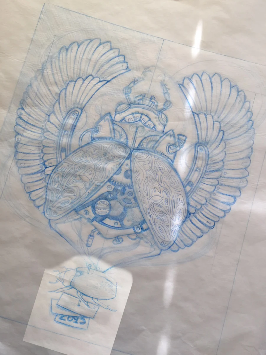
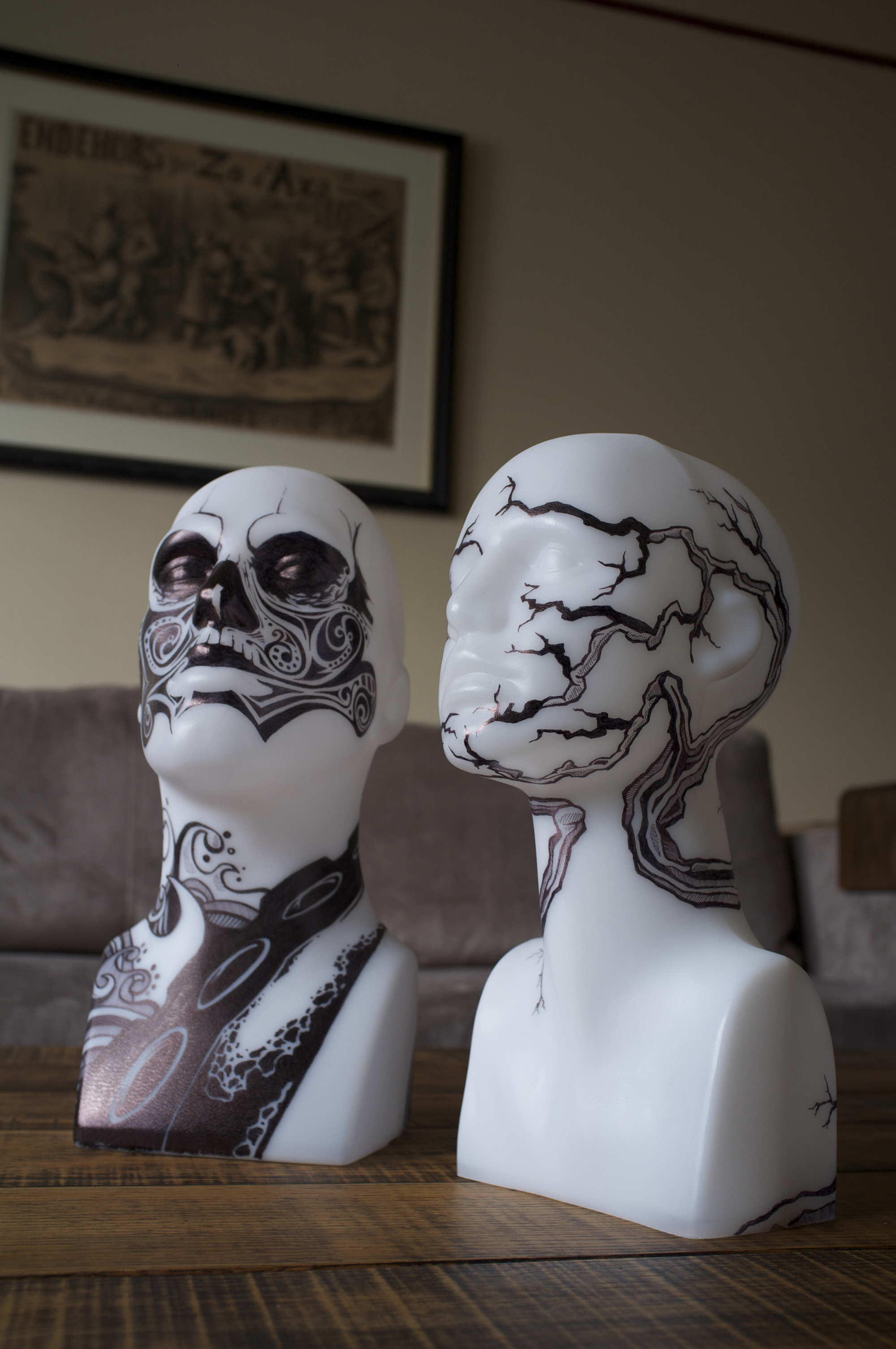
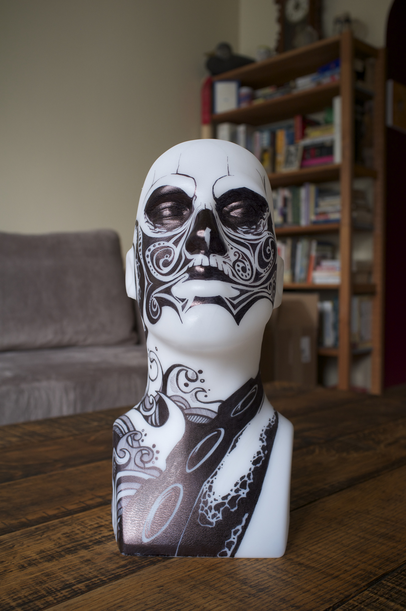
I created these tattooed heads for ECCC 2015. They were simply supposed to be props to display VILE's Logo Beanies. However, they managed to garner such strong attention from the Con attendees, I decided to offer them up for sale.
Each one-of-a-kind design is hand drawn and required about seven hours of hatching with a Sharpie marker. The heads are hard moulded plastic and have a slight texture that helps hold the ink. They require some gentle care due to the fact that the plastic doesn't absorb the ink. Therefore, permanent will remain permanent assuming you don't rub the shit off. Keep them out of reach of your children.
If you are interested in purchasing either one of these custom pieces, you can find them in our Shop — Female head — Male Head