Viewing entries tagged
design

F5Labs Protecting Applications Report: Version 3

After three solid months of production, hundreds of hours, and many bleary-eyed nights this project can be unveiled. 


Original "Stack"

Project Stats

  • 2 complete cover concepts and illustrations (version 2)

  • 3 design layouts

  • 7 full page illustrations

  • 18 spot illustrations

  • 6 icons

  • 4 page variations for stack

  • 2 color variations

  • 16x9 web image

  • prepping dozens of artwork/files

  • many dozens of rounds of revisions for all of the above


Application Security Tiers and Attackers

Chapter & Section Artwork 

Introduction Layout and Design 

Application Protection Report Cover Art

Application Protection Report Cover Art

The full report is available for download at F5.com >>

Read about Version 2 >>

F5Labs Protecting Applications Report: Version 2

The Project

I was tasked with "updating" the following graphic. This graphic is the foundational concept behind my client's entire business. In other words, it's been used to sell their services for years. 

Application Security Tiers

At first glance, there seems to be a lot of information being presented. What you don't see is any real clue describing what's happening. Without the assistance of paragraphs of text or a salesperson, the viewer is left to their own devices to derive any meaning.

The application "stack" is represented by icons that tell the viewer very little. And the accompanying text identifiers are equally amorphous.

You'll also note a variety of graphic elements that are meant to clue the viewer in to a larger idea, but all of these elements largely fail to create a cohesive visual narrative for anyone trying to decipher the graphic.  


My Solution

The solution I arrived at solves these issues — I created visual metaphors that accurately depict what literally happens at each tier. The simplicity of the imagery and design affords a viewer with no prior knowledge of the basic concepts a means of "creating" a narrative for themselves without the help of accompanying text. 

The "isometric" grid underlying this illustration helps create a plane for the tiers. I added flags at each level to help draw the users eye through the entire illustration. Once the basic art was created, I made a few slight adjustments to accommodate the text for the next two graphics. 

Application Security Tiers Revisited

Application Security Tiers Revisited

After

Before

In layout

Overall, this is a highly successful piece. That it was a casualty of "committee" is just a consequence of opinion. It happens. 

Stay tuned for the next version. 

Loryka

Loryka

Loryka was a groundbreaking web security company and tool developed by entrepreneur and programmer Justin Shattuck. In his own words, Loryka is "a platform and data pipeline that allows researchers to gain insights into the attacks we see [on the web]."

Bell Masonry

Bell Masonry

Bell Masonry is an family-owned company that has been operating in greater Kansas City for nearly 100 years. They were in the process of going through a corporate restructuring and wanted to overhaul their company’s brand for the future.

Logo

Their team specified three primary criteria for a new logo:

  1. Visually portray "masonry"

  2. Suggest the idea of a company that has spanned "generations"

  3. Make it timeless.

These concepts are difficult enough to pull of as individual elements, but all three, in a single mark? This is precisely the kind of challenge I love. 

After the initial round of concepts, this is the first pass with the direction I felt was most promising.

Concept

After doing a bit of research I found that two objects appear in 99.8% of all logos for masons: bricks (brick patterns) and trowels. These images are so pervasive that they can be found in nearly every possible design solution down to mimicking the classic Masonic fraternal logo because there are literally no other objects that could represent "masonry". My initial pass included bricks, trowels, and a couple terrible attempts to represent the Bell family business with a bell ... and a brick pattern. I threw out those samples almost immediately. And thankfully, my client listened to my rationale for not choosing a bell with brick pattern as their logo. 

The only other object that makes sense visually is an actual mason. After doing a handful of initial sketches, I hit upon the idea of drawing a mason from yesteryear to represent two things visually: masonry and generations. It worked. The initial icon was a realistic portrayal of a mason from around the turn of the century. My client liked the idea but felt that the rendering and fonts were a little too "elegant" for his clientele. Their portfolio was broader than the luxury home market and, consequently, he was leaning back toward the bell with brick pattern. I asked him to let me play around with the illustration as well as the fonts to address his concerns. 

Original icon and simplified version

Icon variations


Final logo sheet with marketing samples

A Flexible Solution

I'm drawn to logos that provide flexibility for use in different media. A logo that requires an icon to be understandable isn't a successful logo. Nor is a logo that can't be modified to work in both horizontal and vertical formats. The final logo sheet shows how the Bell Masonry logo can be adjusted to work in multiple formats. 


After successive passes, I chose a heavy, highly readable sans serif font with hard edges (like bricks) and simplified the mason icon by removing nearly all of the detail. In the end, my client was absolutely thrilled with the final result. And I managed to create a logo that incorporated all three of the elements they requested: masonry, generations, and timelessness. 


Final, approved Bell Masonry Logo


F5LABS THREAT ANALYSIS REPORT VOL 3: THINGBOTS

The third volume of F5Labs's Threat Analysis Report was a blast to draw. My challenge for this issue was to create robots that visually represented the most common IoT devices exploited by attackers worldwide ... affectionately called, "Thingbots". What artist doesn't enjoy drawing robots?

f5-tar-iot-thingbots-jul-2017-FINAL-edited.jpg
f5-tar-iot-hunt-feb-2017-FINAL14.jpg

How were the robots created?

Both robots were hand-sketched with a 2B pencil, then scanned, and imported into Procreate on the iPad. The drawing was then refined, flat color was added, then exported as a PSD using Airdrop. The final piece was modeled in Photoshop and placed in the report layout using InDesign. Easy peasy. 

F5LABS THREAT ANALYSIS REPORT VOL 2: Hunt for IoT

Selected pages from the second whitepaper OddBurton designed and illustrated for F5Labs Threat Analysis Reports: The Hunt for IoT: The Networks Building Death Star-Sized Botnets from IoT Minions.

Published by F5Labs. Authored by Sara Boddy and Justin Shattuck.

Published by F5Labs. Authored by Sara Boddy and Justin Shattuck.

How was the artwork created? 

I created numerous very rough pencil sketches to work out the initial layout of all the objects within the iceberg. Once I had the arrangement I composed in my headspace worked out, the final flat-color painting was created entirely in Procreate on the iPad Pro using an Apple Pencil. I drew the house and the top of the iceberg separately, then composited the bottom of the iceberg and the top in Photoshop. The final artistic touches including the iceberg planing, shading, some of the smaller objects like the narwhal and seagulls, and the text were added in Photoshop. 

Using F5Labs Application Threat Intelligence Report

The artwork for this heavily illustrated report entitled: Using F5Labs Application Threat Intelligence was drawn entirely on an iPad Pro and colorized in Photoshop. 

Published by F5Labs. Authored by Ray Pompon and Sara Boddy.

Published by F5Labs. Authored by Ray Pompon and Sara Boddy.

Worth noting that the concept for this piece is a visual representation of the Four Domains of Warfare as established by the Department of Defense: Land, sea, air, and space. In 1995, a fifth dimension was added: Cyber space (denoted by connected dots). 

How was the artwork created? 

Nearly all of my work begins with a pencil. This piece was no exception. I drew a very rough sketch to layout all of the objects in the landscape, took a photo, and imported the sketch into the Procreate app on the iPad. All of the line work was drawn using an Apple pencil in Procreate. The line drawing was exported as a PSD and imported into Photoshop to add color. 

F5Labs 2016 Telemetry Report

Selected pages from F5Labs 2016 TLS Telemetry Report.

Published by F5Labs. Authored by David Holmes.

Published by F5Labs. Authored by David Holmes.

How was the artwork created? 

The cover illustration started as a pencil sketch which was photographed using an iPhone, then pulled into Adobe Illustrator for reference. The entire finished piece was rendered in Illustrator. The sweeping dot stream was created line by line, converted to outlines, then placed, duplicated or deleted by hand to achieve the "data" look. Yes, I went cross-eyed. 

F5Labs Threat Analysis Report Vol 1: Minions

DDoS's Newest Minions: IoT Devices represents the first quarterly white paper that I designed and illustrated for F5Labs Threat Analysis Reports. You can view or download the full document here

All told, this project required approximately 150 hours to complete the visual presentation including all illustrations and graphic design. 

Published by F5Labs. Authored by Justin Shattuck and Sara Boddy.

Published by F5Labs. Authored by Justin Shattuck and Sara Boddy.

For comparison, I've included a selection of corresponding pages from the original report below. 

How was the artwork created? 

The cover illustration was drawn and inked entirely by hand. The final rendering was scanned, then imported into Photoshop to clean up the line work and add color. 

Visualizing Web Security

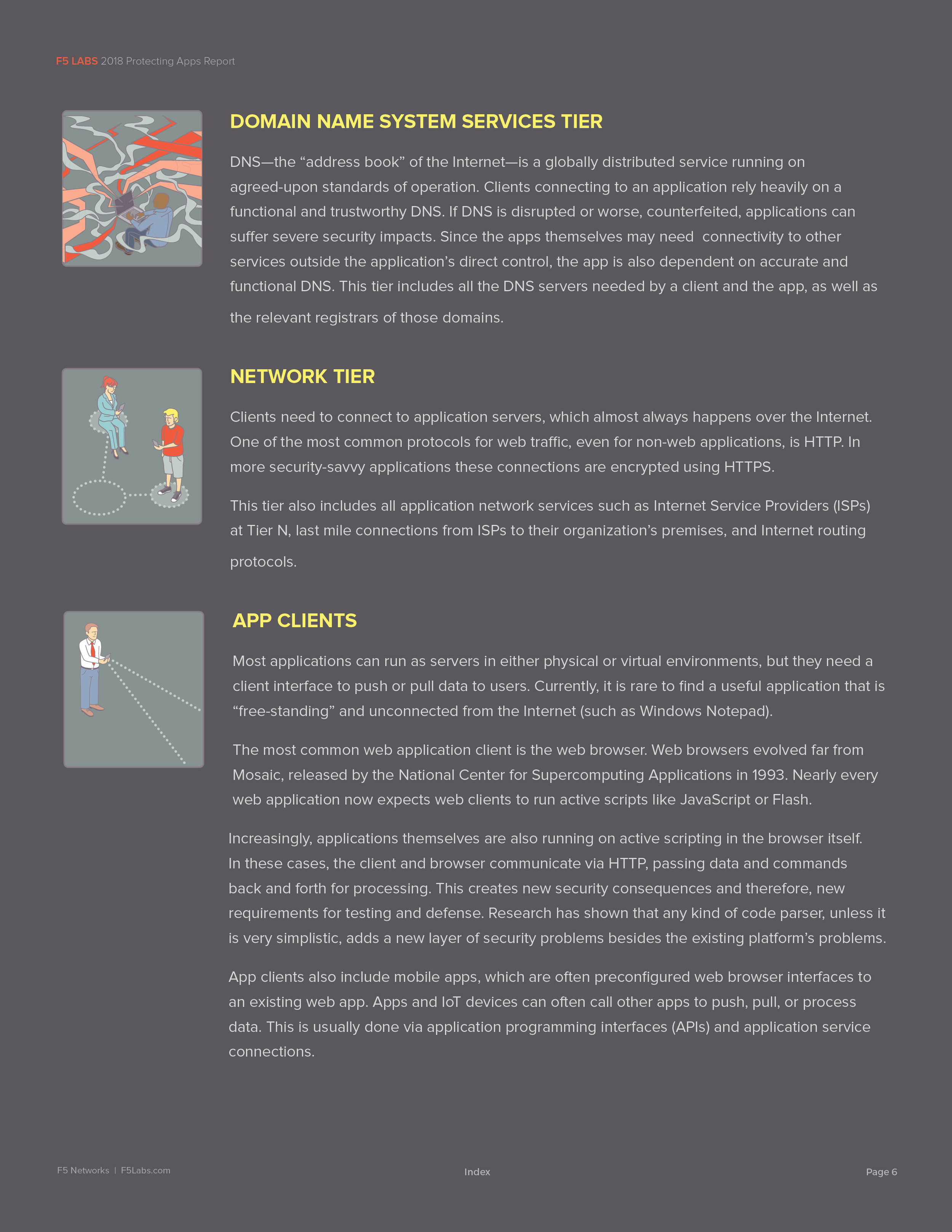
Last August, I was approached by a long-time friend, Justin Shattuck, about a potential opportunity with a local web security firm to illustrate and design a quarterly report published by F5Labs that utilized data aggregated by an analysis tool he developed called Loryka. The product of this tool is a highly detailed report and he wanted to add an illustrated flair to what was a very plain document ... Hence, a late night phone call to tell me that he'd passed my name along to the VP of F5Labs. Turns out that the VP had already seen my work at the Ballard Beer Co. and admonished Justin to "get [me] in here tomorrow!" 

Given the fact that design is severely lacking across the web security industry as a whole and that the current benchmark produced by a competing firm was, shall we say, uninspiring, I knew immediately this was a golden opportunity to significantly raise the bar. There are few things I enjoy more than a challenge and concocting visual representations of an obtuse topic ranks among the most challenging tasks that I've been faced with up to this point in my career. 


My task, as I chose to frame it, was to establish a new benchmark for design in the web security industry.
 

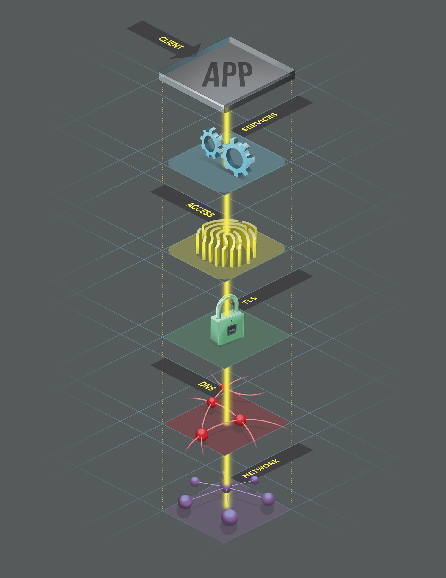
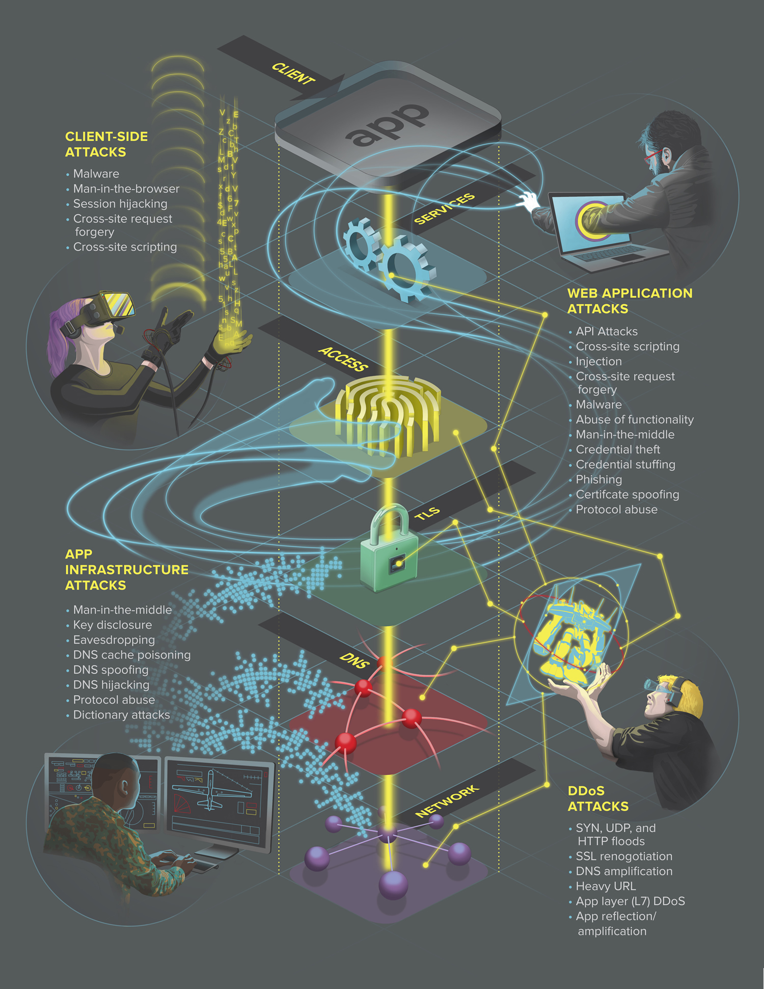
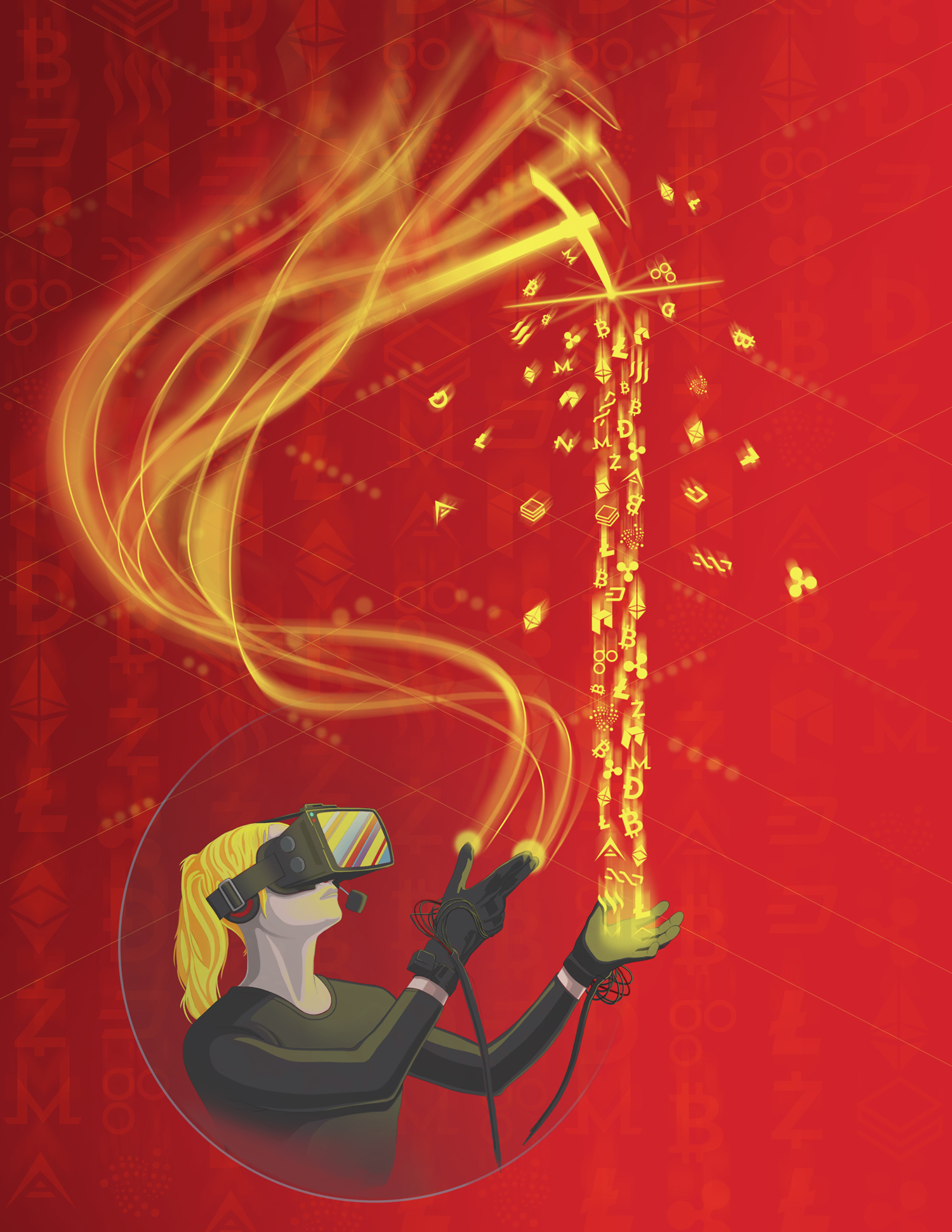
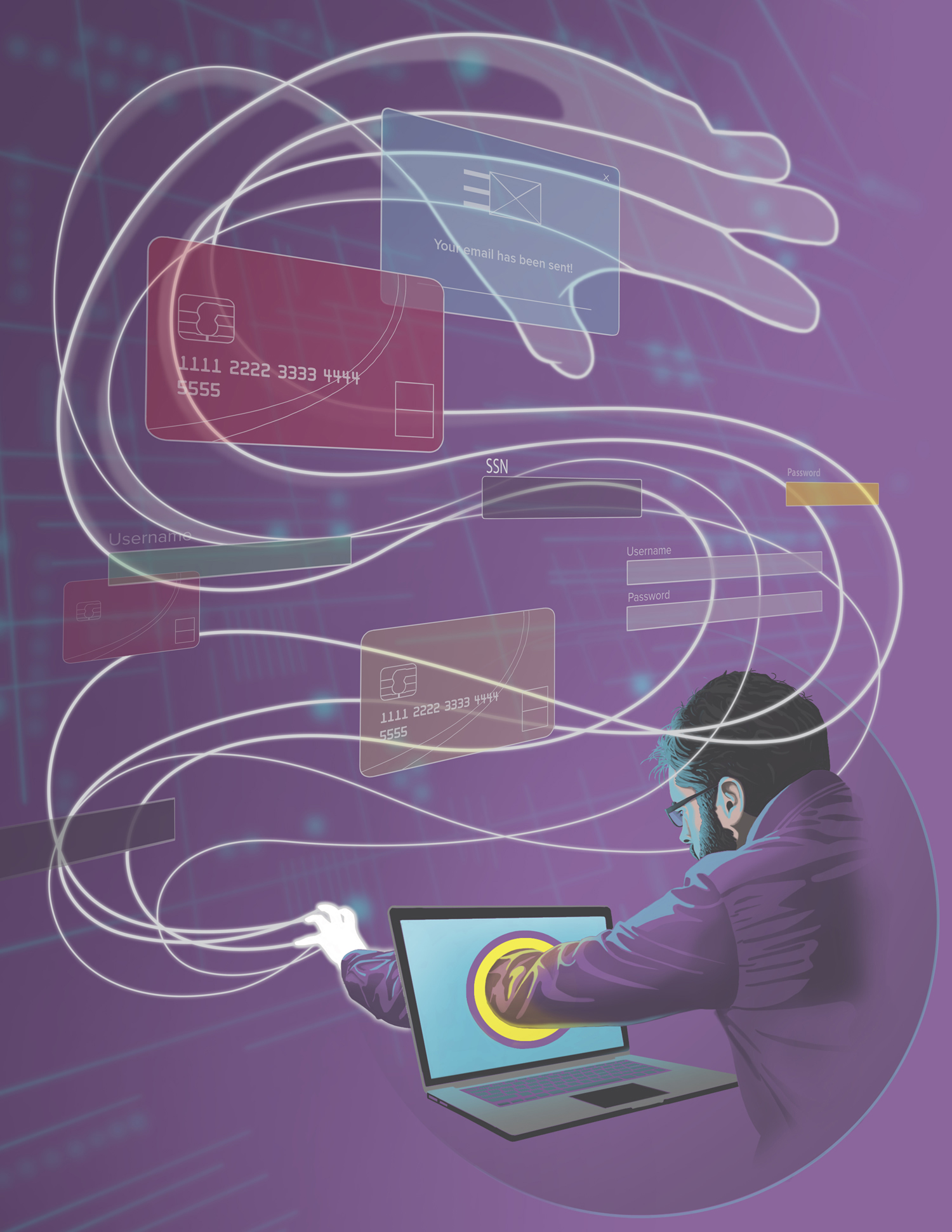
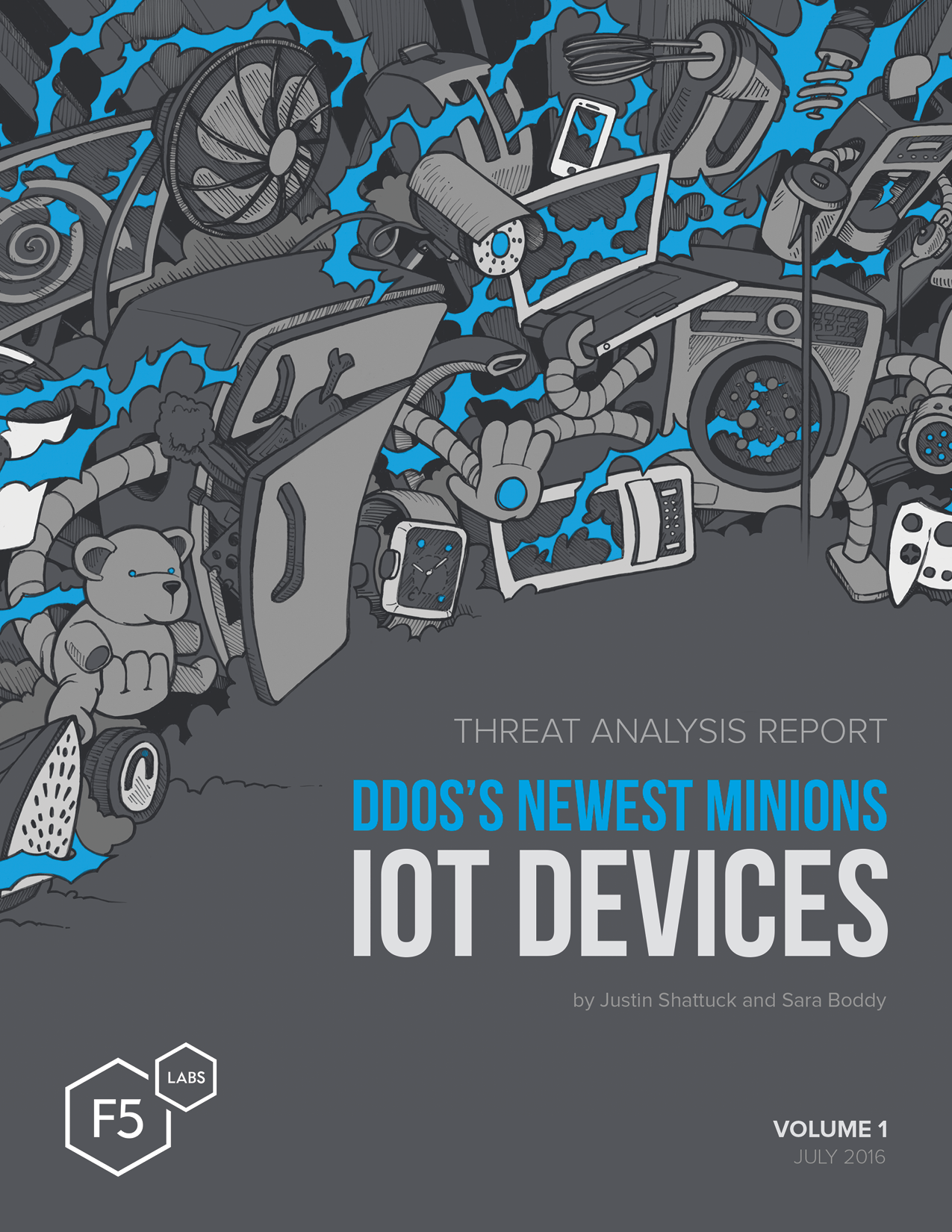
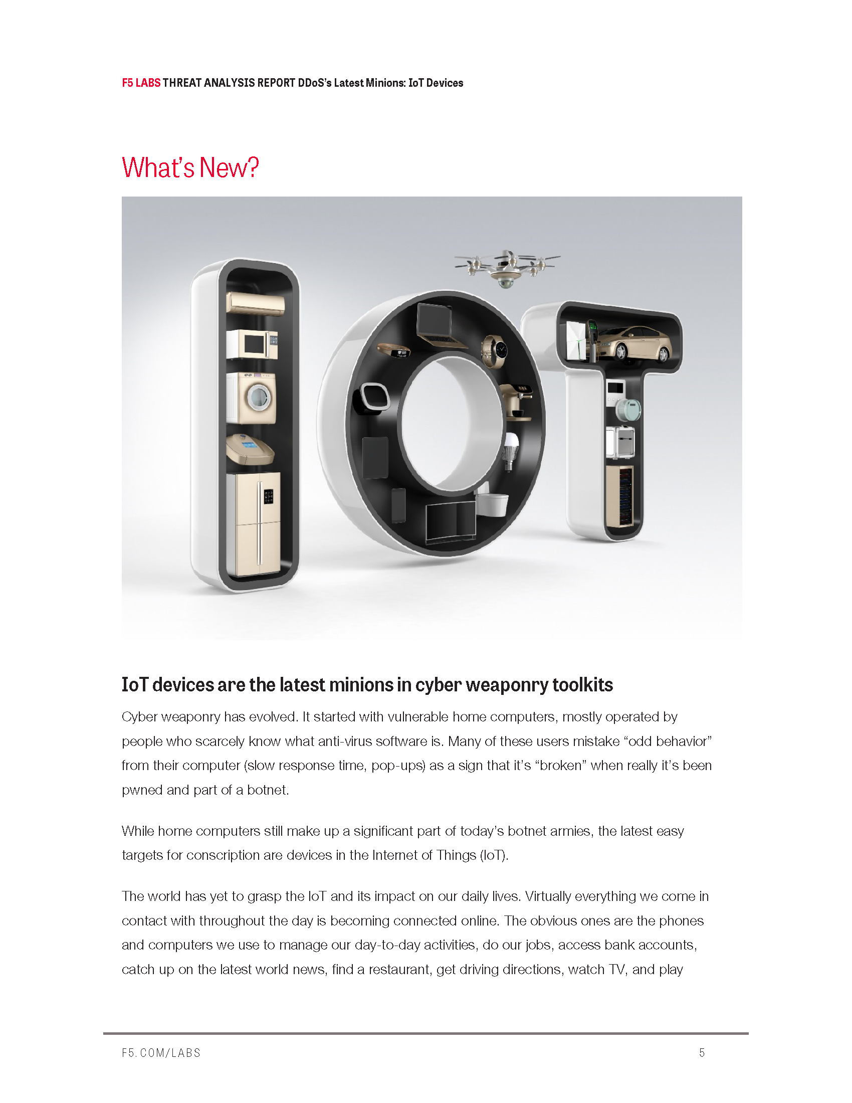
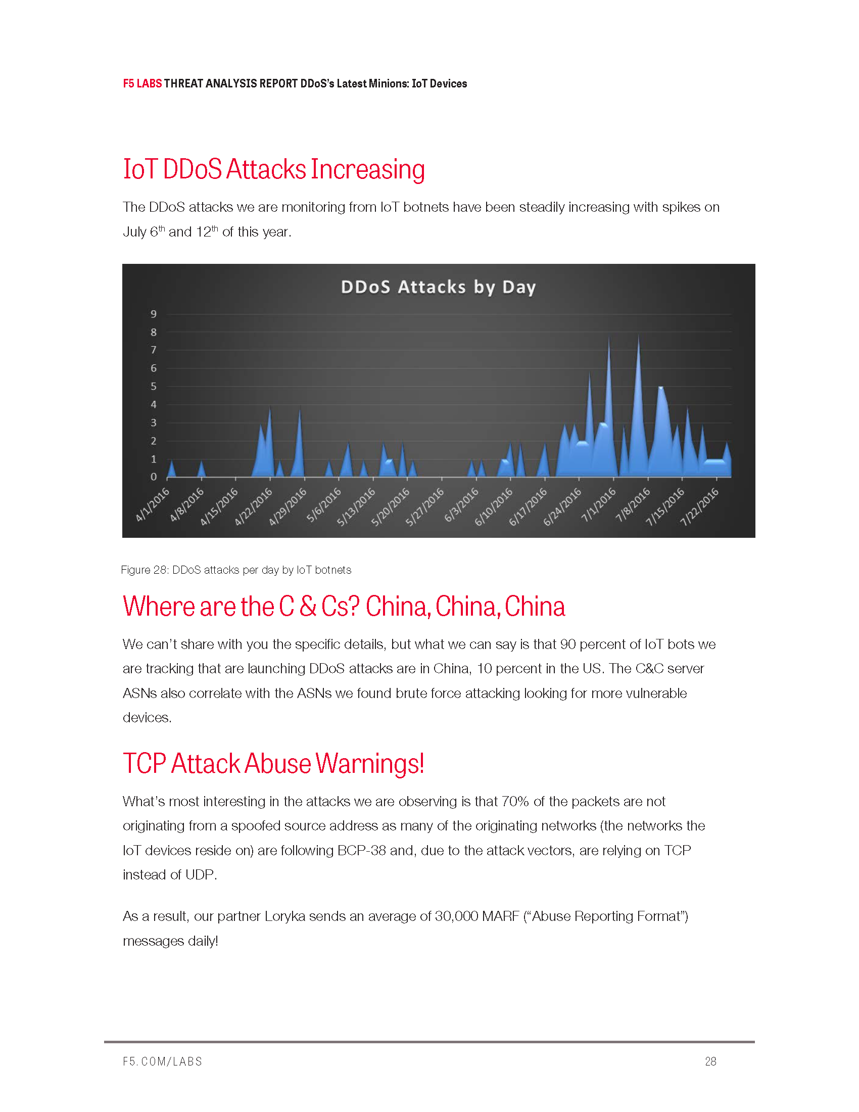
I was given mostly free reign to follow my creative instincts within the confines of their brand identity. The initial design was unceremoniously scrapped and I started fresh with the intention of using custom art to help convey the abstract themes of each report through editorial illustrations, vignettes, updated graphs and charts, and vastly improved content layout.

Due to my work on the first Threat Analysis Report, I was given the opportunity to design two additional reports as well. Thus far, I've completed four whitepapers that average twenty-five pages in length. Every single visual aspect of each report from design to the artwork to the graphs and charts have been completely re envisioned by OddBurton. I'm damned proud of the work and thrilled to be working with the stellar team at F5. 

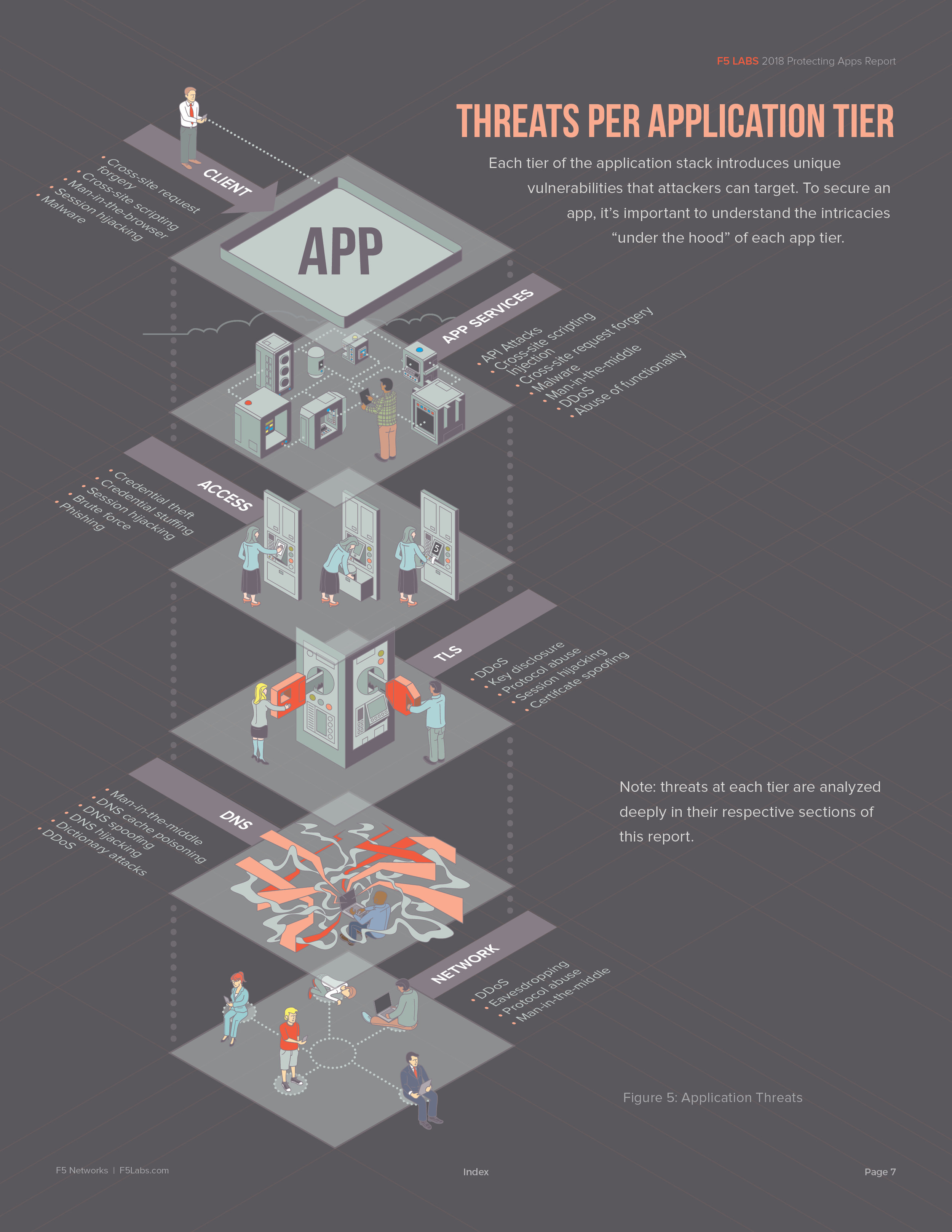
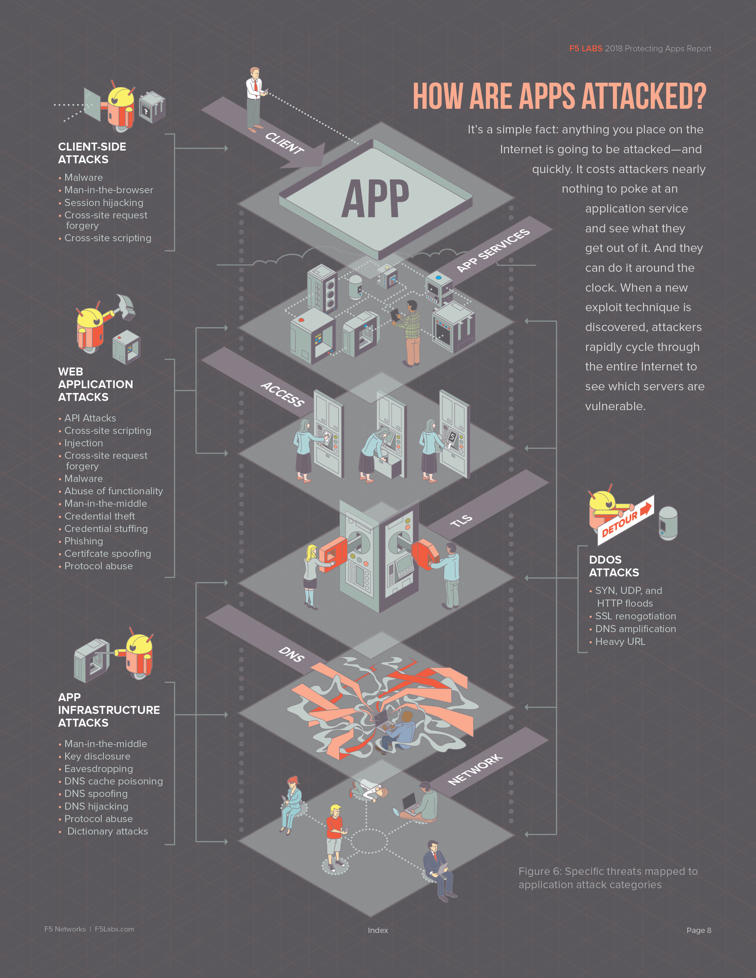
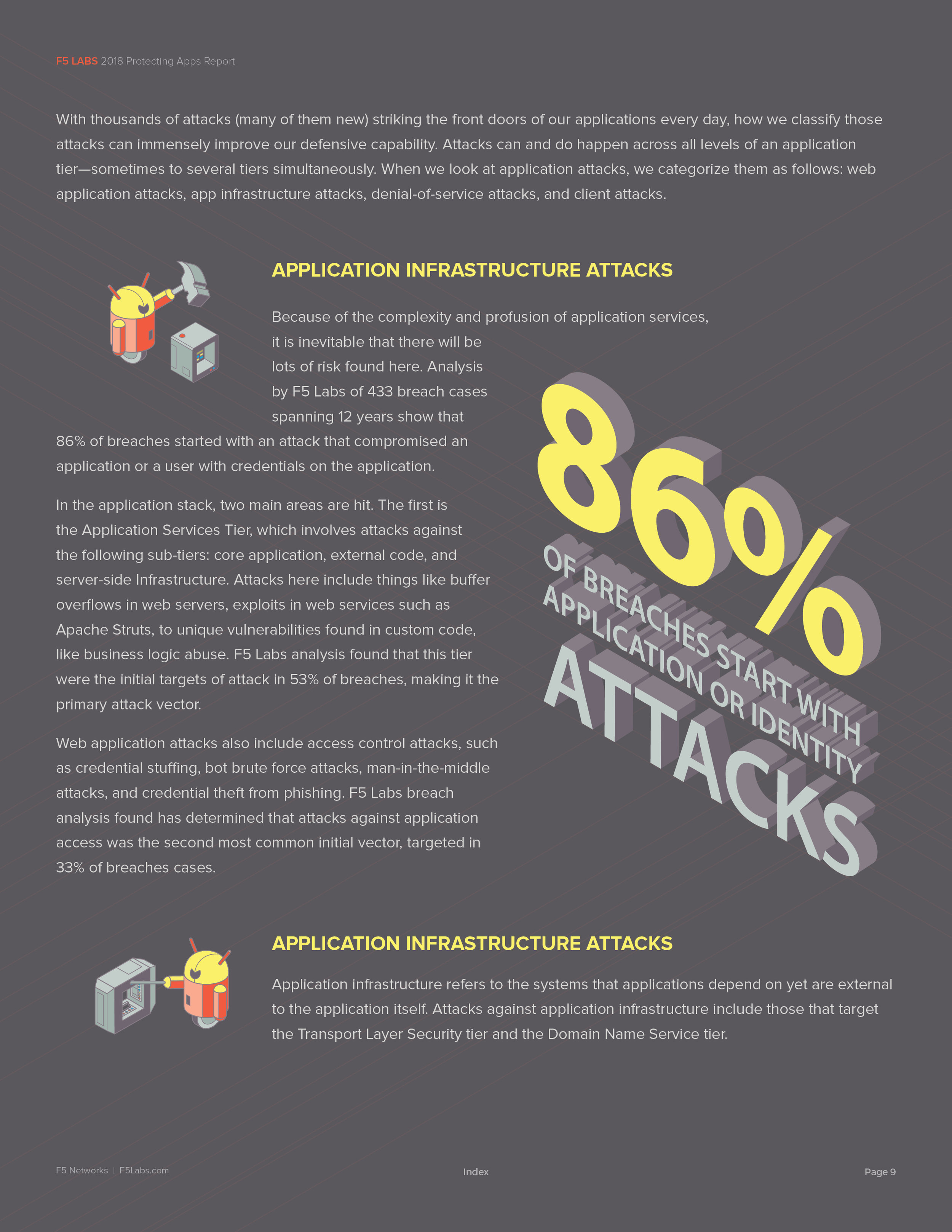
Click on the covers below to view selected design and illustration samples from each report:

Special thanks to Justin Shattuck and Sara Boddy for patiently describing the security landscape and suggesting potential concepts, Debbie Walkowski for her editing, and Preston Hogue for giving me a chance.

Vote, And...

I have a keen interest in politics and education. When my good friend and enthusiastic political activist, John Culver, asked me if I'd be interested in contributing to his latest get out the vote project: Vote, And, I jumped at the chance to help out.

Web site design

Web site design

Icon set

Icon set